Valence Biologics
A Higher Standard in Peptides
Your trusted source for quality research peptides.
Featured Peptides
Popular research peptides
Browse a few of our most-requested products.
Research Use Only
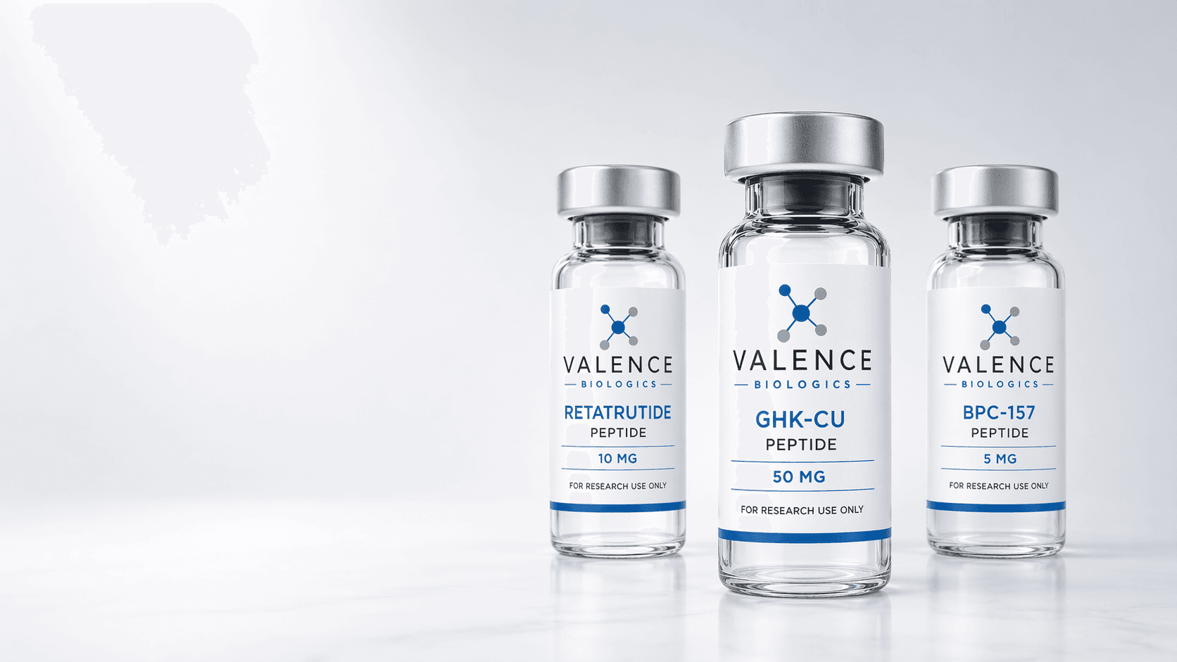
Retatrutide
Studied in clinical research as an investigational multi-receptor agonist in metabolic and weight-management models.
Research Use Only
BPC-157
Explored in preclinical studies related to tissue repair, inflammatory response, and gastrointestinal protection.
Research Use Only
GHK-Cu
Studied in published research involving skin remodeling, collagen activity, and tissue-repair pathways.
Why Choose Valence
A clearer way to order research peptides
Clear Product Information
Vial sizes, product details, and research-use information are easy to review before you order.
COA Information
COA details will be linked on applicable product pages so available testing information is easy to review.
Simple Ordering
A streamlined cart and order flow designed to make the process straightforward from start to finish.
Responsive Support
Questions are handled with clear communication and support from order review through delivery.